HI, I'M MICHAEL BUTLER, A GRAPHIC DESIGNER WITH A PASSION IN SPORTS, BRANDING, AND PACKAGING. / EMAIL: MICHAELABUTLER6@GMAIL.COM /
HI, I'M MICHAEL BUTLER, A GRAPHIC DESIGNER WITH A PASSION IN SPORTS, BRANDING, AND PACKAGING. / EMAIL: MICHAELABUTLER6@GMAIL.COM /
AZ GOLF
Branding, adobe photoshop, adobe illustratorFor over a century, the Arizona Golf Association (AGA), has served many features and functions of the game across the state of Arizona. Currently serving over 100,000 golfers across the state, AZ GOLF has often prided itself on intentionality and willingness to be at the forefront of new golf initiatives. The rebrand seeks to honor the Association’s history, while taking a bold step forward focused to include a broader audience of golfers of all skill and experience levels. The new look and feel is a reference to the arizona golf landscape, while creating a revitalized appearance that resonates with the greater golf community. Meeting golfers where they are requires us to explore territory outside the country club and sanctioned events. Instead, this rebrand reflects on our relationship with that little white ball and highlights the moments and locations that had the greatest impact on our love for the game.As seen on Brand New.
Full Logo Lockup
vertical mark
Spines draw connection to 1923 founding
2 spines on left
3 spines on right
Logotype is approachable, yet traditional and playful
Logotype is handwritten and imperfect–just like our golf game
Tee integration
Saguaro integration
horizonal script
HOW
WAS
IT
MADE
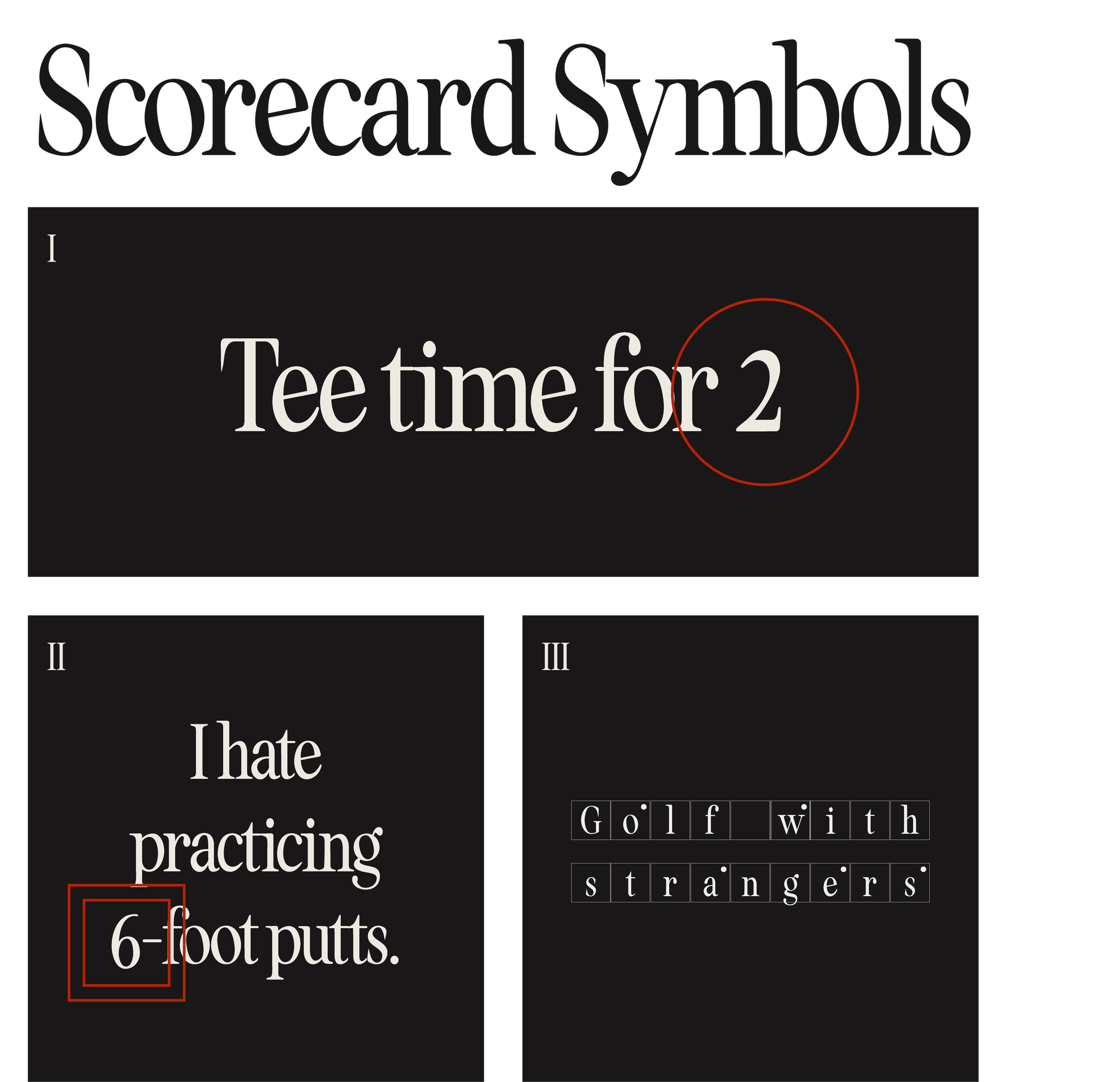
Scorecard Symbols as Graphic Elements
I Birdie/eagle element (a birdie is denoted by a single circle; an eagle, a double circle)
II Bogey/double bogey element (a bogey is denoted by a single square; a double bogey, a double square, a triple bogey +, a triangle, etc.)
III Handicapped hole element (when a hole is handicapped and a stroke is given, a dot is placed in the top corner of the denoted hole)


